Kiwi Insurance
Design Goal
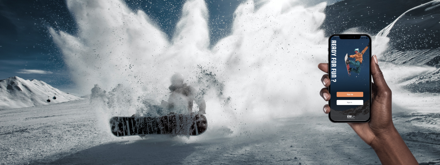
Kiwi Insurance is a mobile app that helps people purchase travel and sport insurance to enjoy their adventurous life. Sport insurance is part of the travel insurance industry, which provides trip protection, personal effects protection, emergency medical coverage and other types of specialized coverage for travel risks. This project involved UI/UX design, research, user testing and multiple design iterations.
Most users struggle with understanding and purchasing sport insurance. That's the main reason I built this App.
- Client: Kiwi Insurance
- Type: Mobile App
- Date: 11.01.2023
- Role: UI/UX Designer
- Tag: New Zealand, Activity, Insurance, Sport
Persona
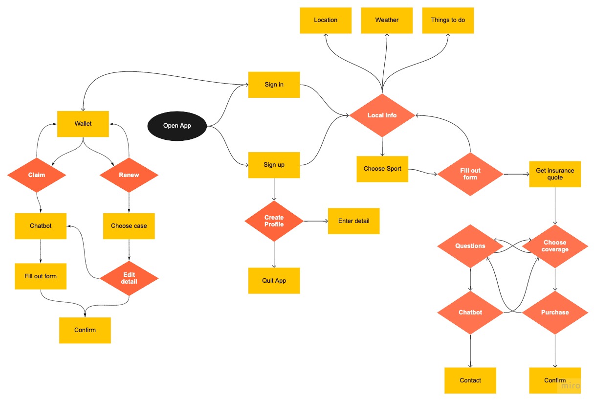
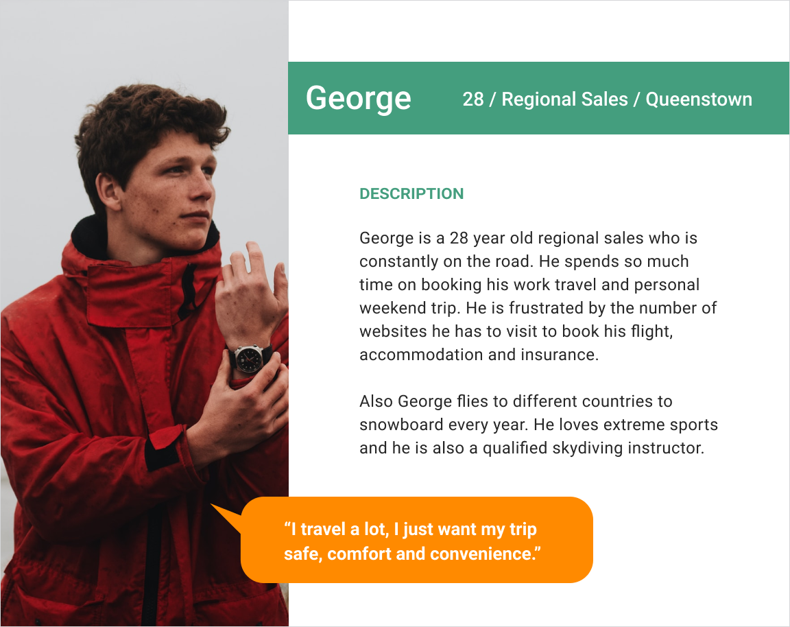
We started the project with a hypothesis that sports enthusiasts who are passionate in risky physical activities don’t have clearly ideas how to purchase and evaluate sport insurance. Kiwi Insurance is using AI and chatbot technology to simplify the purchase and claims process. Also it is providing on-the-go insurance to save users time to do complex research on different kinds of insurance.
Research
Most common travel insurance questions:
- When does the policy start? From the date I purchase or from the date I travel?
- Which travel insurance covers adventure sports?
- Are all extreme sports covered by insurance?
- Do you cover natural disasters or extreme weather?
- How does rental car excess work? What does it cover?
- If I have an accident at home and have to cancel my travel plans, will my flights be covered?
- I am planning to visit a potentially dangerous country, am I covered?
- How can I make a claim for an item that is lost or stolen overseas without a receipt?
From the survey, I discovered that:
- Major travel insurance buyers are male (72.2%) between the ages of 18-40(50%).
- Most people (58.8%) are open to purchase episodic insurance.
- Most users (74.1%) used mobile phone to search activities and insurance before their trip.
- Users strongly prefer insurance to be priced between $1-$12 per day.
- The deciding factor for most customers looking to buy insurance is the total amount of coverage.
I also gathered some valuable insights from open-ended questions:
- “I want a sliding scale of cost.”
- “Want to see outlined costs and benefits.”
- “Expect to see a fair price and good coverage.”
- “Want to have notifications or reminders of caps.”
- “Ease to use, and clarity about what is covered would be essential. I am honestly not sure what I would pay, but I think it depends on the sport and level of risk I feel I am taking. I go mountain biking, kite boarding, rock climbing, and other things, and I think it would sometimes be a hassle to get new insurance every day I do something.”
Problem & Challenge
Challenge for me:
Designing a product from scratch in an area that I wasn’t familiar with.
Challenge for targeted people:
Price, ambiguity, distrust and lack of clearly available options are major pain points of the insurance purchasing process. People want an easy way to buy and manage insurance which really benefits them.
Design System
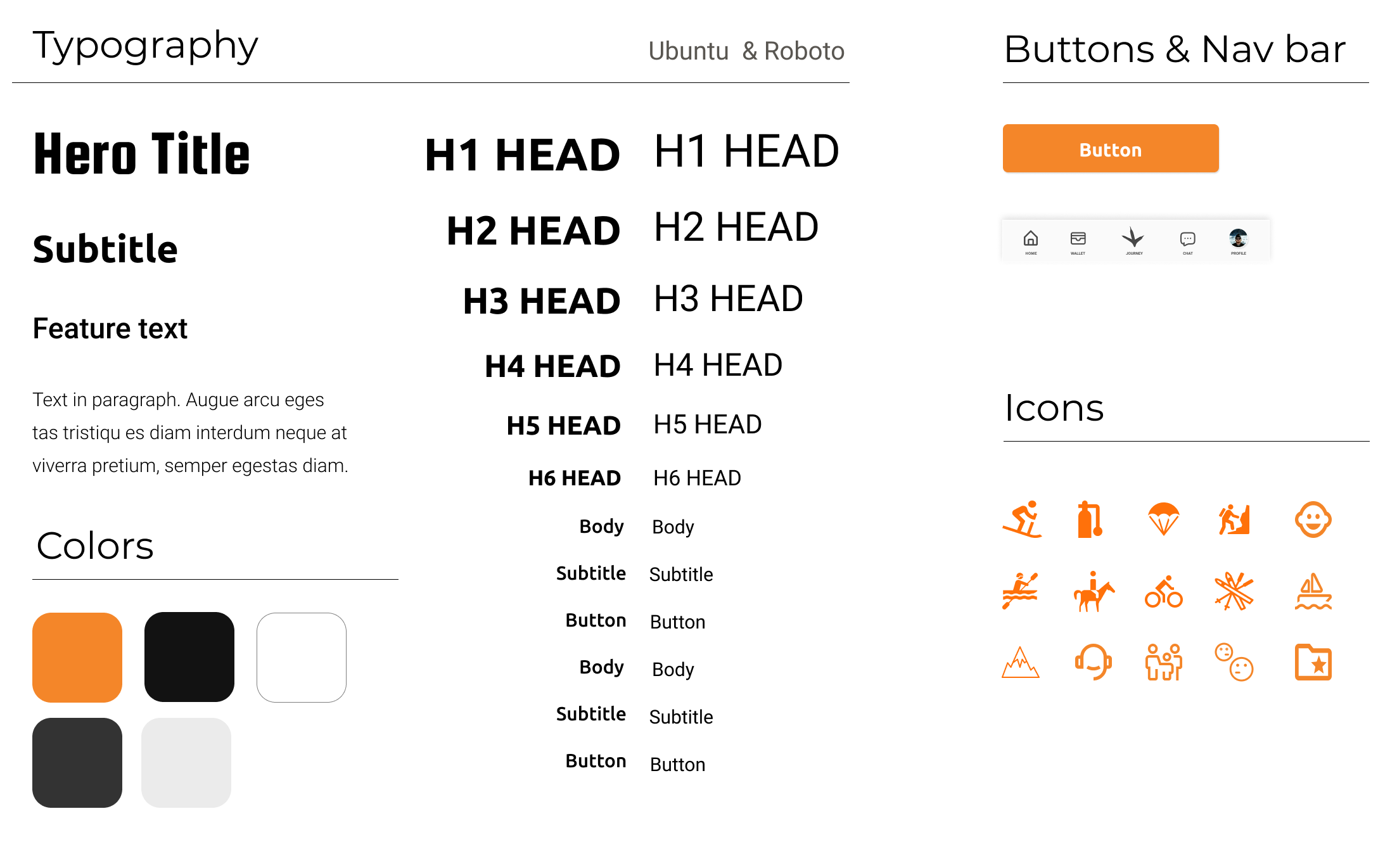
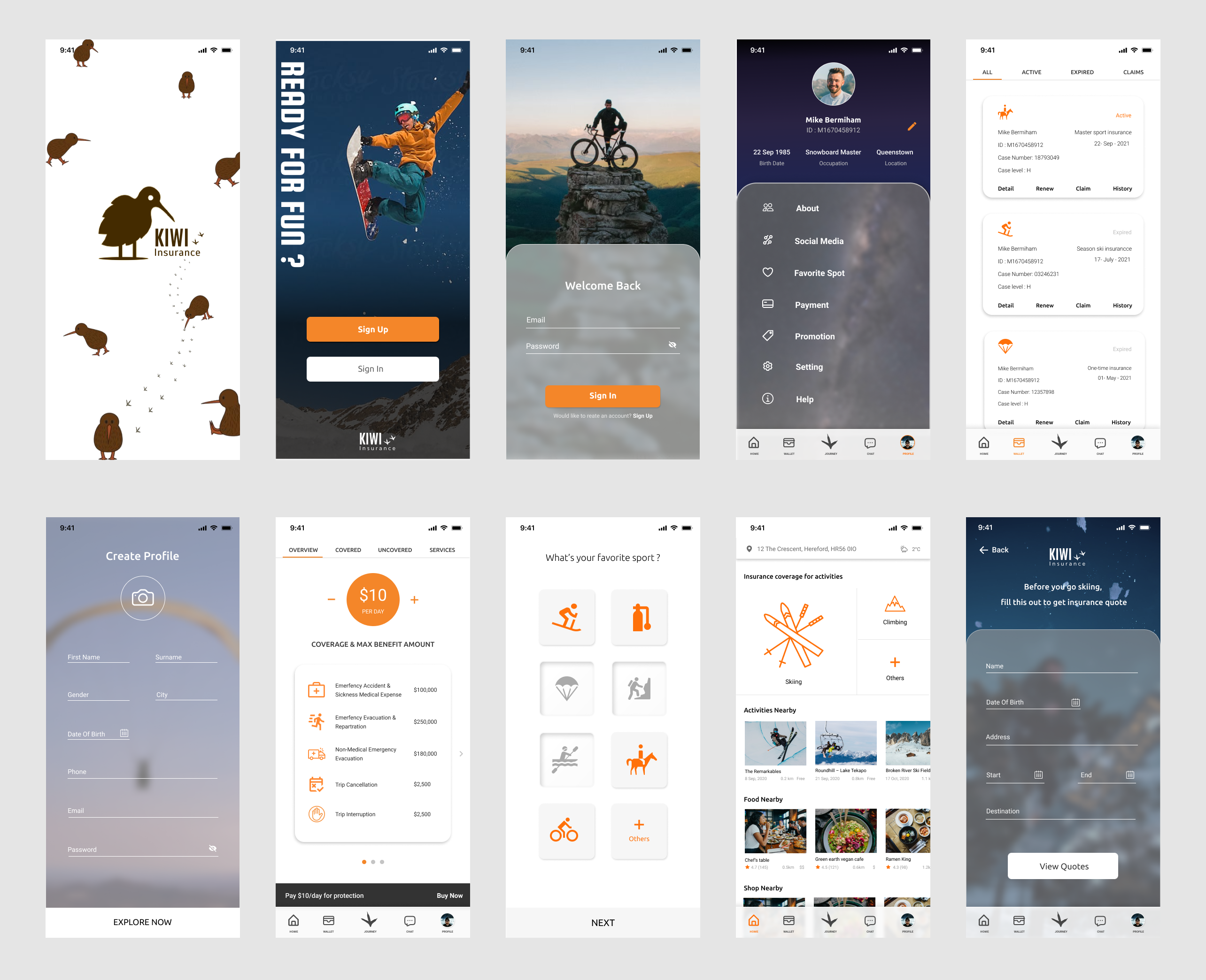
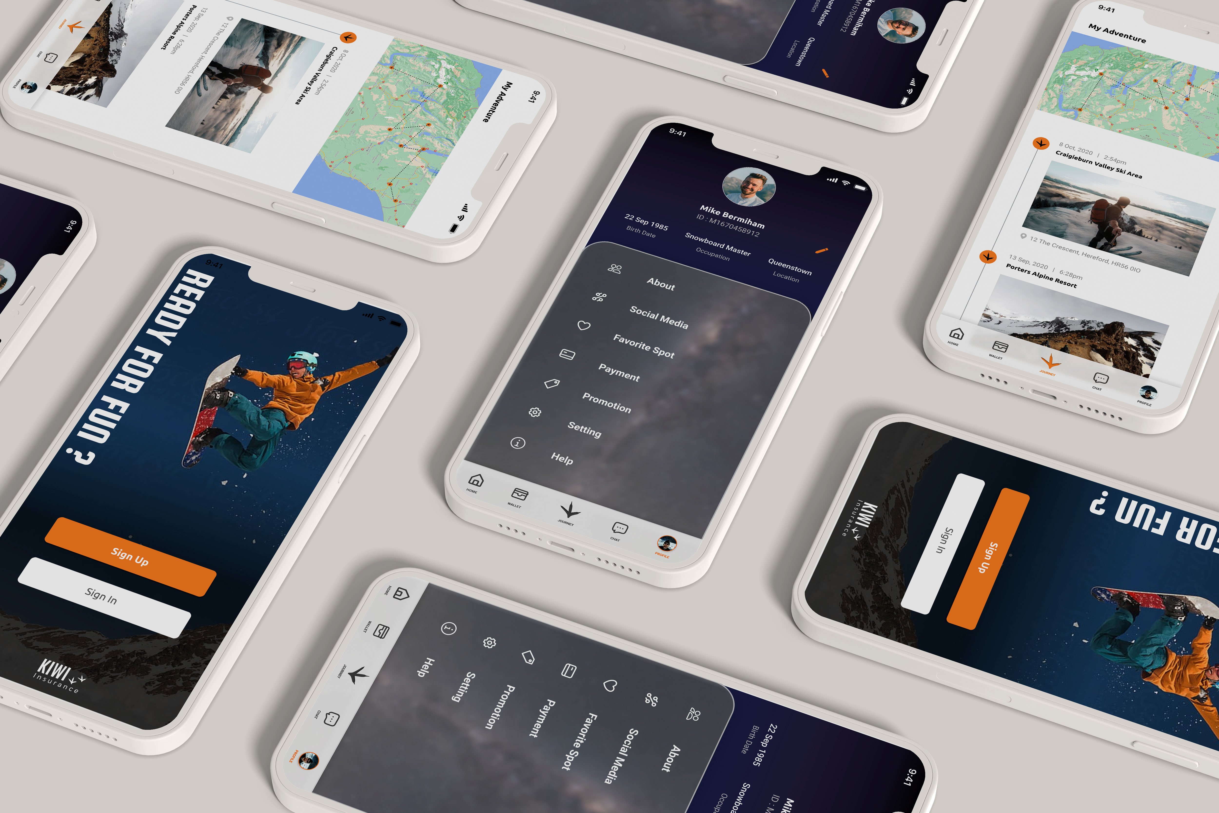
I wanted to go with something that would give out energetic and sporty vibes while best describing travel insurance company. I chose the orange color as I felt that would be best suited for users who love outdoor activities, especially extreme sports. In the same time layers design with glassmorphism style bring out open future sense and also create more negative space with cleaner layout.
